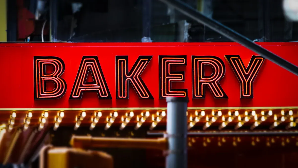
Bakery chain owners often face a challenge: maintaining exact brand color consistency on signs across all locations. Inconsistent branding can reduce customer trust and make a business seem unprofessional. Specifying official Pantone Matching System (PMS) codes to a professional printer is the solution. This simple step ensures brand identity is maintained everywhere. Consistent presentation can increase revenue by up to 33%.
Did You Know? 💡 Color improves brand recognition by up to 80%. Specialized UV logo printing technology translates these exact codes into vibrant, durable colors on acrylic signs.
The Role of Pantone in Brand Consistency
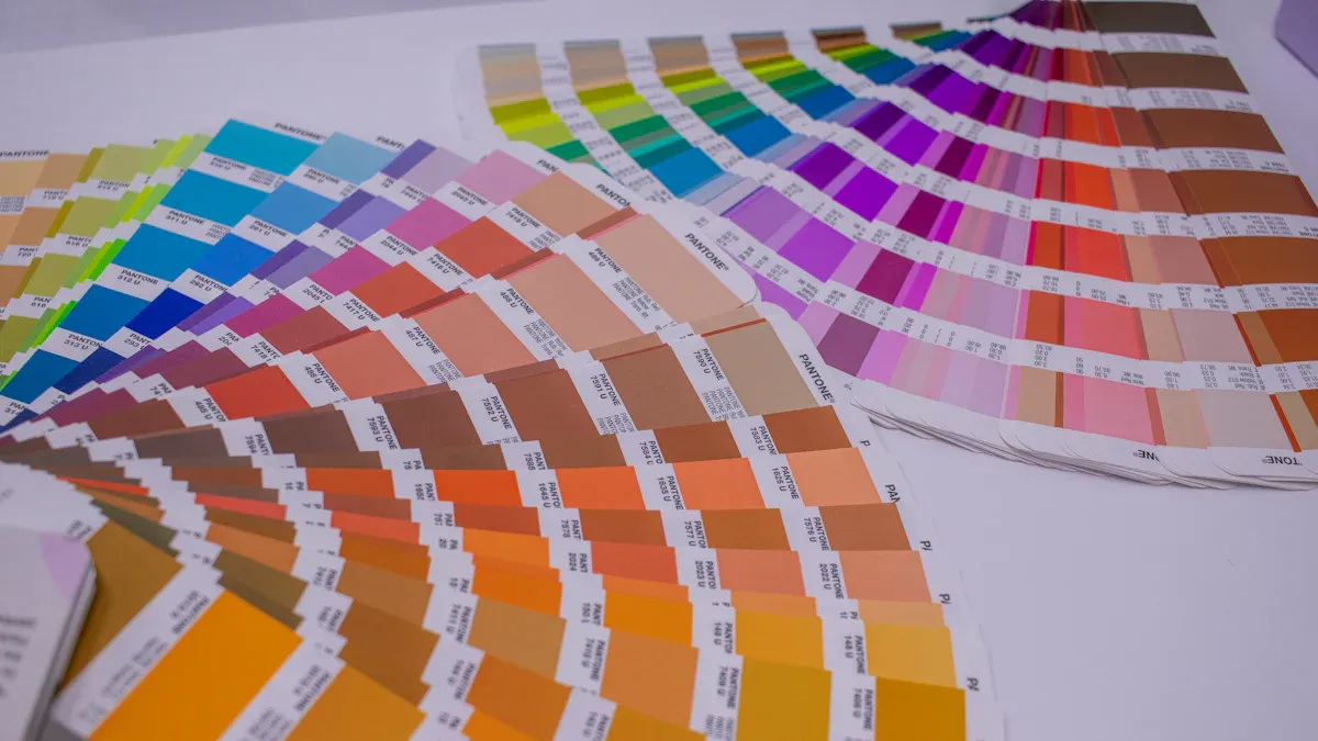
What is the Pantone Matching System?
The Pantone Matching System (PMS) is the universal language of color for brands and printers. Lawrence Herbert created it in 1963 to solve a common problem: inconsistent color reproduction. The system gives every specific shade a unique code, like PANTONE 18-1663. This code eliminates guesswork. It ensures the fiery red of your logo in one city is identical to the red on a sign in another. Printers use this code to mix a precise ink, guaranteeing perfect color every time.
Why Brand Identity Depends on Color
Your brand’s identity relies heavily on color. Consistent color use can improve brand recognition by up to 80%. Customers form an emotional connection with your bakery through its signature colors. Think of how La Segunda Bakery Cafe uses a warm color palette to create a specific cultural feeling. This consistent visual cue builds trust and makes your brand memorable. An inconsistent color, however, can weaken that connection and make a business appear less professional.
A Universal Standard 🌎 The Pantone system transforms color from a subjective idea into a measurable science. This precision bridges the communication gap between designers, bakery owners, and printers, preventing costly errors and production delays.
Pantone Spot Color vs. CMYK
Pantone and CMYK are two different methods for printing color. Pantone uses “spot colors.” A printer creates a single, solid ink for your exact brand color. This process ensures absolute color accuracy for your logo printing.
CMYK, on the other hand, creates colors by mixing tiny dots of four base inks: Cyan, Magenta, Yellow, and Key (black). While great for photographs, this method can produce slight color variations across different printing machines and materials. For a brand color that must be perfect, the precision of a Pantone spot color is unmatched. It guarantees your bakery’s signs look exactly the same at every single location.
From Pantone Code to Acrylic Sign
Translating a precise Pantone code into a finished acrylic sign involves critical decisions about color verification, materials, and printing technology. Each step ensures the final product perfectly matches the brand’s visual identity.
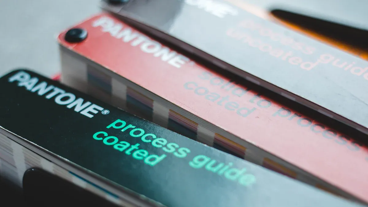
Finding Your Official Pantone Color
The most reliable way to select or verify a brand color is with a physical Pantone Formula Guide. This book of color swatches is the industry standard. It shows exactly how a color will look on a physical surface, removing the guesswork of digital screens.
Digital tools can provide a starting point but have limitations. Achieving a perfect color match from a screen is a technical process.
- Digital color profiles (ICC) do not always account for how colors appear on non-paper materials like plastic.
- Some vibrant shades exist outside the standard color range (gamut) of digital displays and CMYK printers.
- Online converters like those from
codeshack.ioordnschecker.orgcan find the closest Pantone match for a digital RGB or CMYK value, but they are not a substitute for physical verification.
Pro Tip 💡 Always use a physical Pantone Formula Guide for the final color approval. This ensures what you see is what the printer will produce, preventing costly mistakes in your sign’s logo printing.
Choosing the Right Acrylic Substrate
The type of acrylic used for a sign directly impacts its durability and appearance. The two main types are cast and extruded acrylic. Cast acrylic is harder and more scratch-resistant, making it ideal for high-traffic areas and outdoor signs. Extruded acrylic is a more cost-effective option suitable for indoor applications.
| Feature | Cast Acrylic | Extruded Acrylic |
|---|---|---|
| Durabilidad | More durable, higher impact resistance | Less durable, more suitable for indoor use |
| Scratch Resistance | More scratch-resistant | Less scratch-resistant |
| Weatherability | Excellent for long-term outdoor use | Good, but may degrade faster outdoors |
| Coste | Generally more expensive | Generally less expensive |
| Best Use | High-end displays, outdoor signs | Indoor signs, point-of-purchase displays |
Beyond the type of acrylic, a printer’s technique is vital. For clear or colored acrylic, a professional printer will apply a white ink base layer before printing the logo color. This foundational layer makes the final color appear vibrant and true to its Pantone code, preventing the acrylic’s color from affecting the logo’s appearance.
The UV Logo Printing Process
The key to durable, high-quality logo printing on acrylic is UV (ultraviolet) printing. This advanced method uses specialized inks that are cured, or dried, instantly by UV lights.
When the UV ink is applied to the acrylic, the UV lamps trigger a chemical reaction. This process, known as polymerization, creates a strong molecular bond between the ink and the sign’s surface. The ink does not soak into the material; it hardens on top, forming a robust, touch-dry finish. This makes the final sign highly resistant to scratches, fading, and water damage—perfect for a busy bakery environment.
An Eco-Friendly Choice 🌱 UV-cured inks offer significant environmental benefits. They are free of the Volatile Organic Compounds (VOCs) found in traditional solvent inks, which contribute to air pollution. Furthermore, modern LED UV printing systems use up to 70% less energy than traditional heat-drying methods, reducing a bakery’s carbon footprint.
Best Practices for Bakery Signage
Following best practices ensures that a bakery’s investment in high-quality signage pays off. A clear process for proofing, partner selection, and standardization guarantees brand consistency across every location.
Always Request a Printed Proof
A digital image on a screen cannot show how a color will look on acrylic. Bakery owners should always request a physical proof printed on the final sign material. This step is non-negotiable. It allows for checking the Pantone color under real-world lighting conditions.
The Science of Color Matching 🔬 Professionals measure color accuracy using a value called Delta E (dE). A dE value below 1.0 is invisible to the human eye. A target dE of 2 or 3 represents an excellent color match for most brands, ensuring the printed color is virtually identical to the specified Pantone code.
Partnering with a Printing Specialist
Choosing the right printing partner is critical for successful signage. A specialist in UV printing on acrylic will have the right equipment and expertise. Bakery owners should ask potential partners key questions to verify their capabilities.
- How do you ensure Pantone color accuracy?
- Are you G7 certified for color management?
- Can you provide samples of similar past projects?
- What is your quality control process for multi-location orders?
A printer with G7 certification demonstrates a proven ability to achieve color consistency. This qualification is a strong indicator of a reliable partner for brand-critical projects.
Standardizing for Multi-Location Rollouts
Bakery chains need a unified strategy for signage across all locations. A centralized signage program creates ironclad brand compliance. This approach involves creating a Master Sign Plan that standardizes every detail of the logo printing and sign production. This plan should define:
- Approved Pantone Colors: The exact PMS codes for all brand elements.
- Material Specifications: The required type of acrylic and finish.
- Design Rules: Clear guidelines for font size, logo placement, and color contrast to ensure legibility.
This system streamlines production, controls costs, and ensures every customer sees the same professional brand image, no matter which bakery they visit.
Achieving perfect brand color on acrylic signs involves three key steps. This process ensures every bakery location presents a unified, professional image and strengthens brand recognition.
- Use official Pantone codes for color accuracy.
- Partner with a specialist in UV printing on acrylic.
- Approve a physical proof before full production.
Ready to ensure every sign reflects your brand perfectly? Contact us to discuss your bakery’s Pantone sign printing needs and guarantee consistency across every location.
PREGUNTAS FRECUENTES
Is Pantone printing more expensive than CMYK?
Pantone spot color printing can have a higher setup cost for each unique color. However, it prevents costly reprints from color errors. This method provides long-term value by guaranteeing brand consistency, which makes it a wise investment for a professional bakery’s image.
How long will a UV-printed acrylic sign last?
A high-quality, UV-printed sign on cast acrylic can last for many years. Its lifespan depends on proper care and placement. The UV curing process creates a durable finish that resists:
- Fading from sunlight
- Scratches
- Water damage
What if a brand does not have a Pantone color yet?
A business owner should work with a graphic designer to choose an official color. The designer can help select the perfect shade that reflects the bakery’s brand identity.
Expert Advice 🧑🎨 Always use a physical Pantone Formula Guide to make the final color decision. This ensures the chosen color looks correct on a printed surface, not just on a digital screen.
Does lighting affect how the Pantone color looks?
Yes, lighting significantly changes color perception. A color can look different under warm bakery lights versus natural daylight. This is why viewing a physical proof in the sign’s final location is a critical step. It confirms the color appears correct in its actual environment.